
Information Architecture
Making the mobile app intuitive and valuable
Problem
Glooko’s current mobile app has many features that help people living with diabetes live a healthy lifestyle. Our users can connect with their doctor, sync their health data from their diabetic devices (like blood glucose monitors or pumps), or easily keep track of the food they eat.
But after conducting user research, we realized that many of these features are hidden to our users. So how might we restructure the mobile experience to highlight Glooko’s value and help our users find the features that are most impactful to them?
My Role
• Lead designer in charge of facilitating and executing the design process.
• Facilitated internal workshops to understand scope and align stakeholders.
• Conducted generative research to identify key insights and problem areas.
• Crafted new concepts and validated them through user testing.
• Created prototypes and ran user tests to optimize usability.
• Created high fidelity designs used for developer specs and handoffs.
Project Team
• Chase, product manager.
• Christina, user researcher.
• Pablo, design manager.
Understanding the current state of the mobile experience
Early in the design process, we wanted to understand what issues and problems currently exist in our mobile experience. So I collaborated with our user researcher, Christina, to facilitate a “think aloud” test where new users walked through a users first time experience.

Quotes from a “think aloud” user test
We learned that during the first time experience, users do not understand what the Glooko app does or why they would use the app. Or in other words, they do not understand the value the app will provide for them. This led to us asking,
How might we teach users the value of Glooko during their first time experience?
Focusing on our value propositions
The first step was to understand which value propositions resonate with our users the most. So I conducted an experiment to investigate this question. During a user interview, participants were asked to select their favorite app based on the following app descriptions. As they reviewed the apps, they were instructed to “think aloud” so that I was able to gather qualitative data about the features they valued most.
App selection document.
From this test we were able to figure out four key value propositions that users gravitate towards:
Connecting with their doctor and care teams
Hitting their health goals
Stop writing down in a log book
Collect all your health data in one place
Show and tell
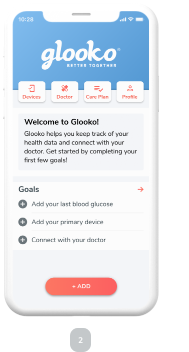
After we understood these value propositions, we came up with a strategy to both tell the users the value propositions and show them. During the first time experience, we tell them the value propositions by displaying four cards.


We then wanted our users to also experience these same value proposition. We did this in two ways. We designed a goal setting framework that progressively onboards them into the app. (You can read about that project here). And we also designed the information architecture to highlight the value propositions so users can intuitively find key features.
Testing + iterating information architecture
I wanted to create an information architecture that highlighted the four key value propositions for our users. To create an intuitive experience, I led several rounds of usability testing to refine the new experience.
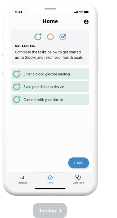
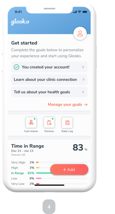
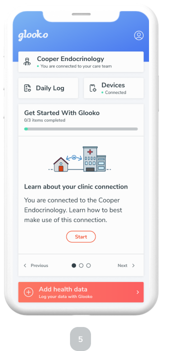
Final Designs
After each round of user testing, I refined the designs to fix usability problems that our participants were experiencing. Below, you can see the final designs and key parts of the information architecture.

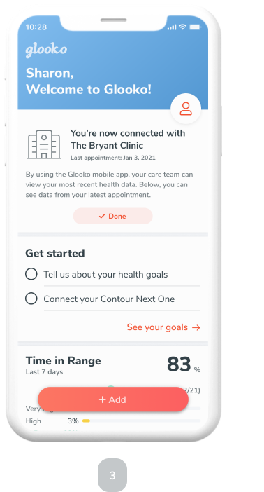
The clinic connection is Glooko’s unique value proposition for our users. We highlight it at the top to make establishing the connection easy and to encourage ongoing collaboration.
“Daily Log” and “Devices” are two ways our users enter data into the app. Having up to date data is key for the user experience.
Onboarding goals that progressively teach the user how to get set up with Glooko. These goals help the user experience Glooko’s core values.
“Add health data” button allows users to quickly log their data from the home screen of the app.
Profile and settings are tucked away but easy to find.
Results
The new information architecture of the mobile app is key to helping users find the features they care most about. It allows users to intuitively experience the app and understand its core value. Further, it sets the foundation for features that Glooko wants to build into the patient experience.
Lessons
• Information architecture is key to helping a user understand an application’s value.
• Testing prototypes quickly highlights potential usability issues and helps prioritize further iterations.
• Design patterns and trends don’t work for all applications. Understanding your specific user group is key to creating an intuitive experience.
Next Steps
• Work with engineering to ship the new feature in a beta program.
• Conduct quantitative tests with live code to further optimize usability.