Glooko Mobile App Redesign

Product Overview
There has been an unprecedented shift to telehealth and remote care over the past year due to Covid-19. This has effected the entire healthcare industry but especially people living with chronic conditions like diabetes. These diseases typically require patients to have quarterly consults with their doctors, who use various data points to assess their current state of health. As these consultations went remote, doctors and patients needed tools that could share this valuable information.
Glooko’s product offering allows patients to log their data all in one place. This includes things like fitness devices, smart scales, and food. Glooko also integrates with 95% of diabetes devices (like pumps and blood glucose monitors) in the market.
The Glooko mobile app allows patients to upload their data remotely and share it with their doctor, resulting in higher quality telehealth visits. However, today the mobile app is geared towards tech savvy users. In order to expand the reach of this tool, the mobile experience needs to be revamped to make it easier for more people to establish care remotely.
Key Projects

Goal setting
We developed a progressive onboarding framework which helps users set up the app quickly and start sharing their data with their care team.

Information Architecture
While redesigning the app, we wanted to establish an information architecture that showcases our unique value propositions and increases usability to our key features.
Role + Process
As the designer tasked to lead the mobile redesign, it was my role to facilitate the design process and execute on designs at each stage. This entailed design workshops, generative research, concept testing, high fidelity designs, and helping with developer hand offs. I worked alongside product management, engineering, and user research at different phases of the process.

A design workshop with different stakeholders across the company.
Below are the parts of the design process that I led:
Facilitated internal workshops to hear product feedback and align stakeholders.
Conducted user interviews to understand current usability issues and discover insights about onboarding.
Led a value proposition test to learn which features our users find most valuable.
Crafted a progressive onboarding concept and tested it to validate the new designs and ensure users could get set up quickly.
Conducted usability tests with new users to optimize the usability of new concepts.
User testing with existing Glooko users to ensure the new designs bring value to existing users.
Design critiques to polish final designs and get them ready for developer hand offs.
Design Iterations + Findings
Through this process, we went through many iterations of the new design. Below you can see these iterations along with key findings for each phase of the process. Each iteration was subject to user testing and design critiques.
Key finding for each iteration
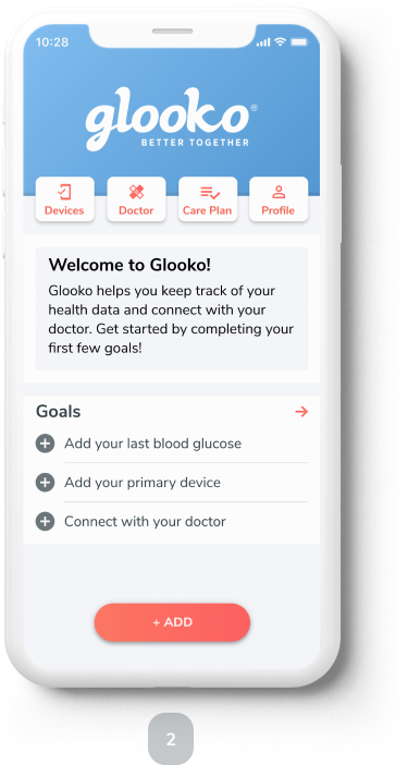
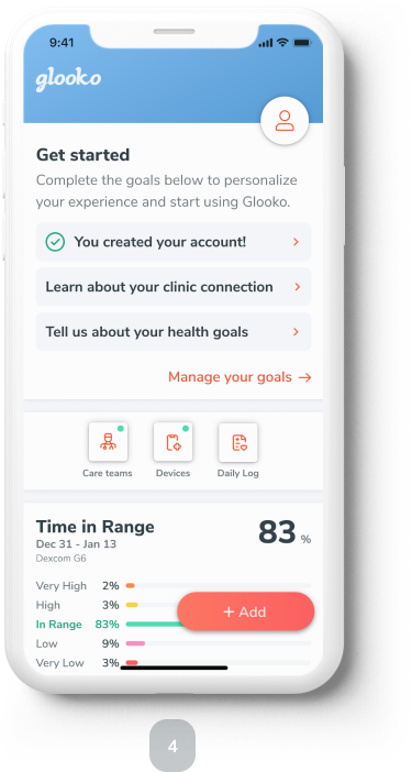
A concept design we called “goal setting”. This prototype helped us validate a way to progressively onboard users and get them set up on the Glooko mobile app.
Internally led the development of a new deign system. I made decisions on color, typography and spacing. This new visual style was then tested further to increase usability.
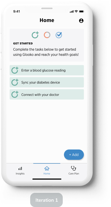
Created a prototype to test the usability of new features and navigation. Here, users struggled to see the add button (banner blindness) and goals needed more affordance.
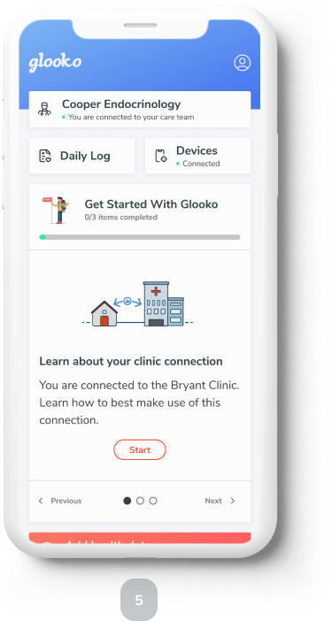
We then iterated and wanted to try a new navigation concept. The “navigation hub” helped users find key actions quicker.
The final iteration focused on making key actions obvious and a clear path for users to get started using Glooko. When tested, users gravitated towards the goals and found the experience intuitive.
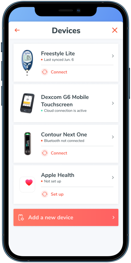
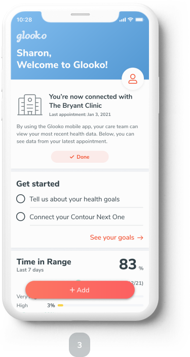
Final Designs
After testing, critiquing, and iterating on the designs, we worked with engineering to write specifications for the new mobile app. These specifications are currently being built in engineering with a beta program launching in Q4 of 2021. During this beta program, we hope to find evidence that the new designs improve the user experience and increase conversion, retention, and engagement. We also believe that this new information architecture unlocks potential for more personal features in the future. You can find a subset of the final screens below: